To measure lead magnet performance in GoHighLevel, group your leads into weekly cohorts and track how much revenue each cohort brings in over time — day 0, day 7, day 30, and day 90 — then break that down by which lead magnet they entered through and which channel they came from. A download count tells you a magnet got attention. The cohort view tells you whether it made money and which one is worth scaling. That second question is the one GoHighLevel's built-in stats can't answer for you, and it's the whole reason this guide exists.
Did your lead magnet actually work? Start by looking at it by week
Start by grouping your leads into weekly cohorts and reading the revenue each week brought in over time. Looking week by week normalizes your averages, which matters because the fastest way to panic for no reason is to stare at a single bad day. A week smooths that out and shows you the real shape.
Here's what that looks like in practice. Say one week's cohort had 192 leads, and those leads brought in $3,000 within the first day. Then you watch the same cohort at 7 days and 30 days to see whether it keeps producing or settles back down. In this example the cohort spiked and returned to baseline within 24 hours, which is itself a signal: the value showed up fast and then flattened. Neither good nor bad on its own, but now you know the pattern instead of guessing at it.
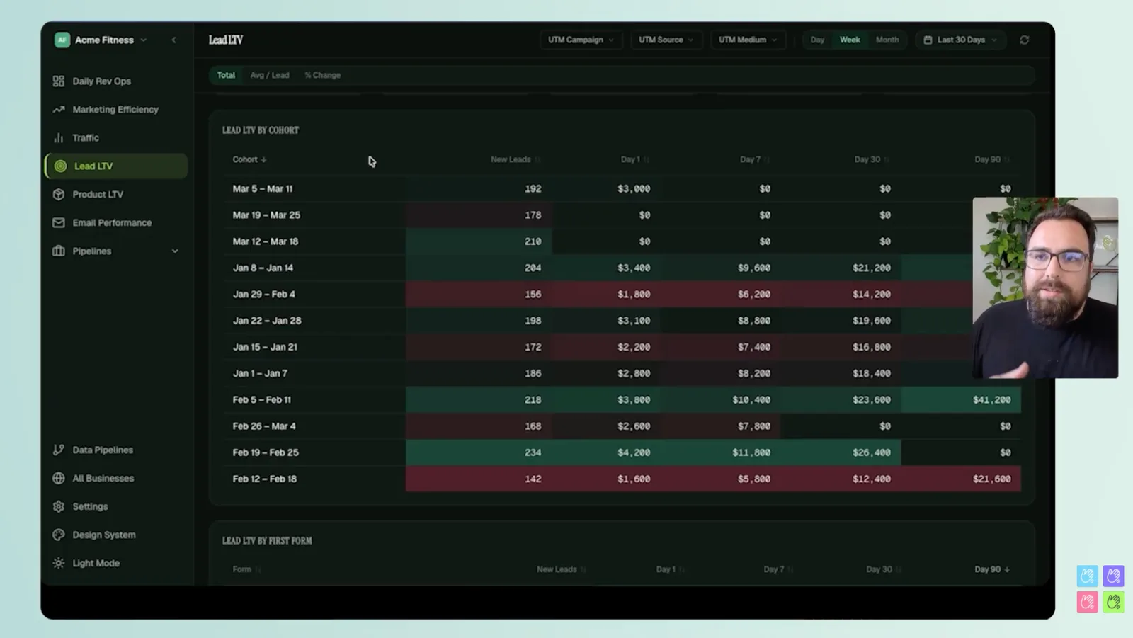
Once you're in a cohort, you can click into it and see exactly who bought what without digging through your GoHighLevel contacts one by one. Meal plans, 12-week transformations, an online course bundle, the low-ticket products — the purchases sit right there against the cohort. That's how you validate a hunch: click, and look at the actual orders behind the number.
Why GoHighLevel's built-in reporting falls short for this
GoHighLevel gives you counts and opt-in rates at a point in time. It'll tell you how many people downloaded a magnet and what your form conversion rate was. What it doesn't build is the curve — the value of a cohort as it moves from day 0 to day 90 — and without that curve you can't tell a magnet that pops once from a magnet that keeps paying you back.
This isn't a knock on GoHighLevel. The point-in-time numbers are genuinely useful for running the platform day to day. The missing layer is the one that turns those counts into a decision: average value per lead inside a time window, revenue by cohort over time, and the same view broken out by entry point and source. That's a reporting layer that sits on top of your GHL data, and it's what the rest of this guide walks through.
How much is one lead worth? Setting your break-even CAC
Take a cohort, pick a window — 30 days is a good default — and divide the revenue that cohort produced by the number of leads in it. That average is what one lead is worth to you inside that window, and it's also the ceiling on what you can spend to acquire a lead before you stop breaking even.
That single number changes how you buy traffic. If a lead is worth a certain amount to you by day 30, you can decide to spend $20 per lead, or $60, or $100, and know exactly where you sit relative to break-even instead of hoping. Spend under the number and you're profitable inside the window; spend over it and you're betting on the longer tail to catch up. Either can be the right call, but now it's a call you're making on purpose.
One caution worth keeping in mind: the window you choose is a business decision, not a fixed rule. A 30-day average tells you one thing; a 90-day average can tell you something very different if your revenue keeps building after the first month. Pick the window that matches how patient your cash flow can be.
Which lead magnet should you double down on? Break it down by entry point
Break your revenue down by the point where each person first entered your system — the specific lead magnet or offer they came in through. In one setup that might be a free transformational guide, a free webinar registration, a 7-day signup challenge, and a nutritional assessment, each pulling in leads that behave differently over time.
The trap here is reading it by volume alone. Sorted by total revenue, a color scale runs from red at the low end to green at the high end, and the biggest earners rise to the top simply because they brought in the most people. That's useful, but it hides the per-lead value. Switch the same view to averages and the picture gets more interesting. A "book a consultation" entry point is obviously higher value per lead. But there are volume plays hiding in the middle that the total-revenue view buries.
The nutritional assessment is the clearest case. At $16 per lead on average it looks like a strong candidate to push harder — and it's a PDF, so delivering more of them costs you almost nothing. Compare that to the webinar. The webinar's average climbs over time; by 90 days it can reach around $200 per registrant. Higher value, but you have to deliver it live every time. So the real decision isn't just "which number is bigger." It's the tradeoff between a $16 lead you can fulfill automatically and a $200 lead that costs you a live delivery to earn. That tradeoff is the lever you actually control, and you can only see it once you're reading averages by entry point instead of raw volume.
Which lead source brings revenue back fastest?
Now break the same revenue down by lead source — the channel each cohort came from — and watch how fast each one returns. Some of this is predictable: referrals tend to bring in revenue faster and are usually your strongest source. But the value is in what you didn't expect. In one example, YouTube was quietly bringing in a significant number of buyers, and Google CPC was contributing real volume too.
The point is that channels don't behave the same way over time, and the cohort view is what surfaces the difference. A source that looks slow at day 0 might be a steady producer by day 30. Reading source by source tells you where to lean in and where you're overpaying for leads that never mature.
Track it over time: weekly and monthly cohorts
Weekly cohorts are the right resolution for reading a launch or a recent push. When you're looking at a longer horizon, group into monthly cohorts instead and ask a different question: are we on trend compared to where we were, and are we improving the velocity of return?
Velocity matters as much as total revenue. Pulling revenue forward — getting a cohort to the same value in 30 days that used to take 60 — is a real improvement even if the 90-day number lands in the same place, because it frees up cash to reinvest sooner. The day 0, 7, 30, and 90 checkpoints are how you see whether that's happening. If your recent monthly cohorts are hitting their numbers faster than the older ones, the machine is getting more efficient, and that shows up in the curve before it shows up anywhere else.
No lead step? Measure product LTV instead
Not every business runs on lead magnets. Plenty sell a low-ticket product directly — a $7 ebook, a $7 consult, something in the $9, $19, $29 range — where the buyer never has to become a lead first. For those, you measure product LTV, which is the same style of cohort report pointed at a different starting line.
Instead of grouping by when someone became a lead, you group by when a person first gave you a dollar. They might have been on your list for years; that doesn't matter here. What you're counting is first-time customers: how many you generated, how much they were worth on day 0 (that first transaction plus every upsell they took within the first 24 hours), and what they look like over the following 90 days.
The shape of that curve is the whole story. Take a cohort — say January 8th to 14th — and you want to see people coming in and then buying more products and services over time, a steady incline across the first 90 days. That's the sign you're building a customer base instead of bleeding people dry on day 0. If the curve is flat, meaning you realize all the revenue up front and nothing after, that's your cue to restructure the offer or how you're selling it.
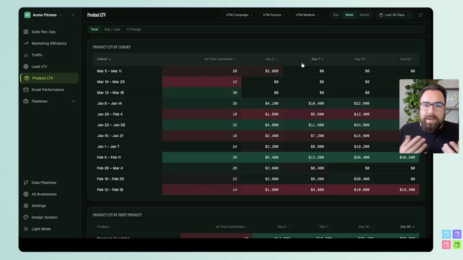
You can also read it by first product purchased. Premium coaching might come in at $500 for that first consult. A 12-week transformation might bring in a chunk of people. A starter membership might start lower but climb over time as those members stick around and spend more. Each first product seeds a different long-term curve, and seeing them side by side tells you which front door builds the most valuable customers.
The one number that predicts lifetime value: the first transaction
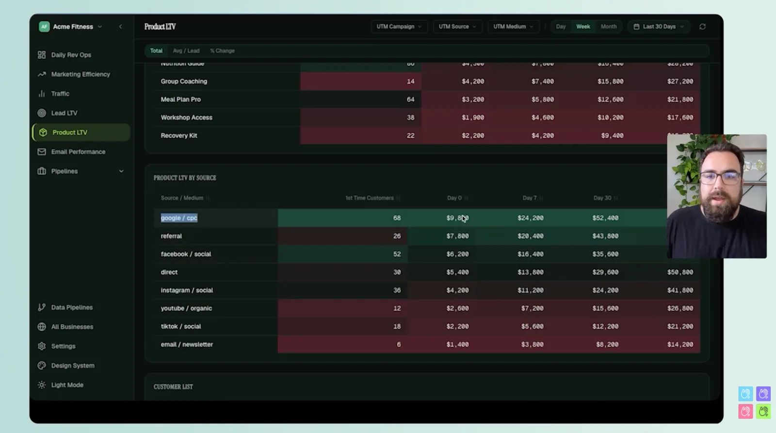
If you only track one thing, track the size of the first transaction. The correlation that shows up again and again is that the first purchase is the biggest predictor of long-term lifetime value. Put plainly: someone who gives you $1,000 upfront is, more often than not, the person who goes on to give you the most over time.
That principle has a direct read on your channels. Google CPC brings in customers through search, and those tend to balloon over time — higher entry, higher long-term value. Facebook and social usually come in at a lower entry point, and a lower entry point tends to carry a lower LTV. Neither is wrong to run. But if you know the first transaction predicts the tail, you can stop judging a channel by its cost per lead and start judging it by the value of the customer it actually produces.
Turn the data into decisions (and feed it back to Meta and Google)
All of this only matters if it changes what you do next, so start by deciding what you're actually optimizing for. Do you want a lot of profit up front? A lot of growth over a longer horizon? Or are you deliberately pushing revenue down the road to realize it at 60 or 90 days? There's no universally correct answer — your math, based on how you've organized the business, decides it. Ask yourself where you want your day 0 value to be and where you want your 90-day value to be, then let the cohort curves tell you whether you're on track.
Two business models both work here, and it helps to know which one you're running. There's high ticket and high velocity, usually paired with a high-ticket sales motion. And there's lower ticket and higher volume, where you're selling $7, $79, $100 things consistently — easier to sell one by one, harder to crack because it only works as a volume play. You don't have to pick a side. You just have to understand which levers you're pulling so you can steer where you want to go.
This is the report Hello Conversions builds on top of your GoHighLevel data — the cohort and LTV view, by entry point and by source, that the native stats don't assemble. And the reporting is only half of it. Hello Conversions also syncs that same data directly to Meta, Google, and other platforms, so the ad algorithms learn from your real buyers and their real value instead of guessing from a browser pixel. Better signal in means better optimization out, which closes the loop between what you measured and what you spend next. If you want a report like this on your own numbers, you can start a 7-day free trial, get your data in, and see your cohorts within the setup.